Navbar Example
While in the quickstart tutorial we used the App container to setup the navbar, you can also opt to use the navbar by itself. The Navbar does not require redux and can be used with plain React.
We'll be using a project similarly configured to the quickstart one. You can find all the code used here.
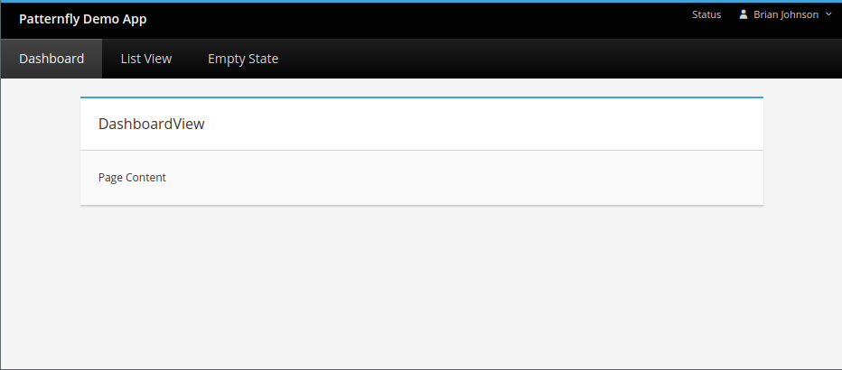
In this example we have 3 views set up:
- DashBoardView
- EmptyStateView
- ListView
The webpack.config.js is configured identically to the one in the quickstart guide.
The main difference is in index.js where we manually set up a react-router:
import React, { Component } from "react";
import ReactDOM from 'react-dom';
import { BrowserRouter as Router, Route, Switch } from "react-router-dom";
import dashboardView from "./dashBoardView/dashboardView.jsx";
import listView from "./listView/listView.jsx";
import emptyStateView from "./emptyStateView/emptyStateView.jsx";

import NavBar from "./pf-lib/navBar/components/NavBar.jsx";
import NavbarUtilityDropDown from "./navbarUtilityDropDown.jsx";
import NavbarUtilityCollapsibleButton from "./navBarUtilityCollapsibleButton.jsx";

import { navbarConfig } from "./configs.js"

class App extends Component {
  render() {

    let navUtility = [<NavbarUtilityCollapsibleButton key='1'/>, <NavbarUtilityDropDown  key='2'/>];
    return (
      <Router>
        <div className="app">
          <NavBar config={navbarConfig} customUtility={navUtility}/>
          <Switch>
            <Route exact path={"/"} component={dashboardView}/>
          </Switch>
          <Switch>
            <Route exact path={"/listview"} component={listView}/>
          </Switch>
          <Switch>
            <Route exact path={"/emptyState"} component={emptyStateView}/>
          </Switch>
        </div>
      </Router>
    );
  }
}

ReactDOM.render(<App />, document.getElementById('root'));
Read more about the react-router-dom here. But in short, it allows for switching between views using the navbar depending on the route. This code is taken care of for you if you use the App Container.
The actual navbar in the code above is outlined below:
<NavBar config={navbarConfig} customUtility={navUtility}/>
The code takes in a navBarConfig object which is pulled from this file here:
configs.js
export const navbarConfig = {
  // The different tabs and the link to where they are routed to.
  categories: [
    {title: 'Dashboard', link: '/'},
    {title: 'List View', link: '/listView'},
    {title: 'Empty State', link: '/emptyState'},
  ],
  // The title image placed at the top, above nav.
  titleSrc: {
    path: '../static/build/img/brand.svg',
    alt: 'Patternfly Demo App'
  }
};
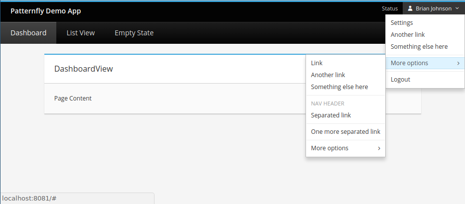
Notice that the navbar also takes a custom utility, this is an element you can pass into the navBar to situate at the top right of the navbar as a dropdown menu, or how you see fit:
let navUtility = [<NavbarUtilityCollapsibleButton key='1'/>, <NavbarUtilityDropDown key='2'/>];
In our example we are passing an array of elements, the NavbarUtilityCollapsibleButton is for responsive purposes, and will display a typical burger icon when the dom window is collapsed. The NavbarUtilityDropDown is the drop down menu shown in the non-collapsed state. Both elements will be rendered by the Navbar ordered by their respective indices.
The code for both can be found within the repo here and here.