Modal example
Here we will add a simple modal to our main page that we created in the quick start demo.
You can find the relevant code in the example-modal branch here.
The first think we need to ensure is that the modalReducer is added to our store. We already did this during the quickstart:
store.js:
import { createStore, combineReducers, applyMiddleware } from "redux";
import thunk from 'redux-thunk';

import messageReducer from "./pf-lib/message/messageReducer";
import modalReducer from "./pf-lib/modal/modalReducer";

export default createStore(
  combineReducers({
    modalReducer, // This store is needed by the modal utility
    messageReducer,
  }),
    applyMiddleware(thunk)
);
Then import the ModalComponentDialog and ButtonComponent in the main_page.jsx file:
import ModalComponentDialog from '../pf-lib/modal/containers/ModalWindow.jsx';
import ButtonComponent from '../pf-lib/modal/containers/ButtonModal.jsx';
Create the content that will appear inside your modal:
// Returns the element content we display within our modal
static createModalContent(){
  return (
    <div>
      <p> Please rate the accuracy of the results! </p>
      <form>
        <div className="radio">
          <label>
            <input type="radio" value={1}/>
            Top Choice
          </label>
        </div>
        <div className="radio">
          <label>
            <input type="radio" value={2}/>
            Within the top 5 choices
          </label>
        </div>
        <div className="radio">
          <label>
            <input type="radio" value={3}/>
            None of the above!
          </label>
        </div>
      </form>
    </div>
  );
}
Create the element that will appear as the button:
// Returns the element content we display as our button
static createButtonContent(){
  return(
    <button className="btn btn-primary m-r-8"> Give us feedback! </button>
  )
}
Finally we apply the modal and button components, giving them a unique identifier that will let the utility know they are paired:
render() {
// Finally we set up our page content to hook into our modal and show our button
// The mid lets the modal utility know that button with mid 001 will activate the modal with mid 001.
return (
<div className="col col-cards-pf container-cards-pf fader">
<div className="cards col-xs-10 col-md-8 ">
<div className="card-pf card-pf-accented">
<div className="card-pf-heading c">
<h2 className="card-pf-title">
Main Page
</h2>
<div className="card-pf-footer">
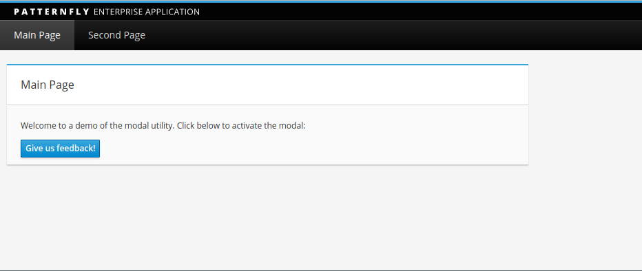
<p> Welcome to a demo of the modal utility. Click below to activate the modal: </p>
<ModalComponentDialog mid="001" modalTitle="Modal Example" modalContent={main_page.createModalContent()}/>
<ButtonComponent content={main_page.createButtonContent()} mid="001"/>
</div>
</div>
</div>
</div>
</div>
)
}
Run npm run build and start the python server.py to see your changes:
After clicking the button we see the contents of our modal:
